
Data Tools to Help You Get Out the Count
As the response rate in Connecticut nears 65%, our recent analysis shows that there are still many tracts that are struggling to increase their self-response rates.
What is a “tract”? The U.S. Census Bureau divides counties into subdivisions called census tracts of approximately 4,000 people (can be anywhere between 1,200 to 8,000 people). These smaller sizes make it easier to compare than towns. In a city, we see that different tracts have different levels of response rates. In Hartford, for example, the highest tract has a 59.7% response rate while the lowest has a 9.6% response rate.
There are many benefits to census tracts. In our Get Out the Count efforts, it allows us to really focus our efforts on encouraging people to be counted in very specific areas.
But we don’t typically think in “census tracts.” I don’t know the census tract number I live in. But I can look at a map of my town and find it. And so can you.
There are two tools I’m going to help you learn in this post. First is the U.S. Census Bureau’s own Response Rates map. The second is the Census 2020 Hard to Count Map. I use both for different purposes, and by the end of this post, you will be using them, too.
U.S. Census Bureau Response Rates Map
What this map is most useful for: Getting a quick picture of response rates at the state, city/town, or tract level.
The Census Bureau’s map is quite simple. If you’re a video learner, you can watch the Census Bureau’s video tutorial. If you want to learn with this post, click on the link and let’s explore together.
When you get to this page, you’ll see a map of the US. You can click on a state on the map, or you can use the filters on the right-hand side of the map to choose where to look.
Click on Connecticut. You’ll see that the rest of the map goes dim and the response rates at the top of the map now show the National Self-Response and Connecticut Self-Response.

Now if you want to look at a more specific area of Connecticut, we have to use filters. In this image you’ll see I’ve chosen to look at counties by highlighting “County”(number 1 in the image) under the Geographies option. This then gives me the option to choose a county with “Select County” (number 2). And with “Select Mode” (number 3) I can look at total self-response rates or Internet self-response rates.
Take a moment to get familiar with the different “geographies” you can look at by clicking around on them.
Now back to the idea of census tracts. Many towns in Connecticut have one census tract. Cities have multiple census tracts, and by looking at tracts you can decide where to focus your Get Out the Count efforts. You can choose “City” (number 1 in the image below), “Census Tract” (number 2), and then choose the city from the “Select city” drop-down (number 3).
You can see major roads and zip codes to help you identify where these tracts are. This is what Hartford looks like with June 1 self-response rates:

Notice the color on this map. This shading is what helps you see the census tracts that are highest and lowest. The deeper the color orange or blue, the lower or higher the self-response in that tract. You see in this map that there are 4 tracts with response rates under 30%. The roads can help you find where geographically the tracts are for you to then provide support in getting out the count in those tracts.
Service at the Center for Urban Research, Census 2020 Hard to Count Map
What this map is useful for: Looking at the characteristics that might result in lower response rates, finding the physical location of these tracts, and planning Get Out the Count efforts based on those factors.
This map uses a search feature in the top right-hand side of the map to help you find a geography you’re looking for. You can type in a state, city, street address, or even a public building (such as a library) into the search bar to go to that geography. Go ahead and type in Hartford, CT in the search bar.

Once you’re looking at a town, you have a number of options available to you.
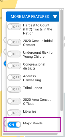
You can add layers to the map with this box on the bottom right. Once you click on “More Map Features” you have many options that you can toggle on (see below). In particular, the “Major Roads” layer is very clear on this map, you can zoom in to see specific streets within and on the border of tracts. Click on “More Map Features,” then choose “Major Roads.”

On the bottom left of the map itself there is a “zoom” feature, the + and - (plus and minus buttons). Click on zoom in (+ button) and you’ll see more roads and even names of organizations start to show.
This is how you can very specifically identify the streets that are in census tracts with low response rates.
Once I click on the tract, I can see the tract number is 5201. You also see we have two new pieces of information.
One is the previous self-response data in the gray charts (number 2). We also see a new drop-down (number 3) that has a wealth of useful data to explore: Census Details for Tract 5021.

Let’s explore this “Census Details” data in the census tract you’re looking at.
Click on Census Details and you get a drop-down like this:

By looking at “Populations that May be Undercounted,” you can see data that can help you focus on the people you’d most like to reach. The U.S. Census Bureau has resources you can provide to many of these groups at risk, including parents and guardians of young children, renters, and the Hispanic population, among others.

We hope this tutorial proves useful and would like to hear how you’re using these maps to improve your Get Out the Count efforts.
If you would like specific information on your town or municipality, please email us, and we can share the town-level data with you.
This analysis was conducted as part of our partnership with the U.S. Census Bureau as the Connecticut Census State Data Center. In this role we serve as the liaison between the public and the bureau, providing useful and digestible information regarding the 2020 Census, as well as other census products.
We provide over 60 American Community Survey datasets, develop census data tools such as the tract to town converter and aggregate margin of error tool, and will analyze the Household Pulse Survey as data become available.